Responsive Designs: A short blog for a cleaner CSS design
Using media queries to enable responsiveness in Web design.


Hello and welcome to my first hashnode blog!
As part of my #neogCamp journey which involves much in depth of web design, I made up my mind to address to some of the Web Design topics which I felt are very relevant for a developer's journey from a beginner to a professional.
What is Responsiveness?
To be "Responsive", is nature of an element change or to "respond" in reason to change in the form or environment in which it exists.
Why Responsiveness?
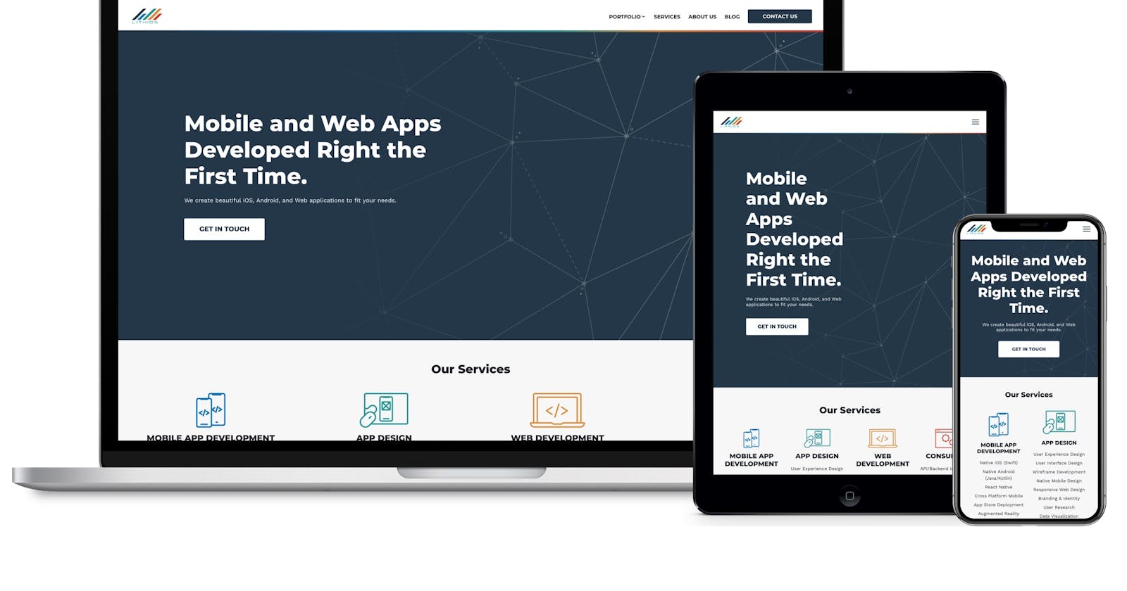
"Responsiveness" in the field of Web Design is associated with screens and hence its contained individual elements being able to respond/change in order to make the interface more friendly in nature. Nobody likes a big logo and teeny-tiny buttons which will not budge on a random screen size maybe a TV, a Smart Watch for example. So how do we deal with such contexts!?
Hmmm..... Oh, yes! I know this, its called a media query.
What is a "media query"?
In CSS3, "media query" is a feature which allows us to set the respective elements to a desired 'state'. "media query" allows us to interact with the basic form-factor and 'state' of the application while running. In layman terms, we can set a particular CSS styling to the application elements when it reaches a certain state. Like, when a dive gets 1000px wide or maybe when a paragraphs becomes 100px long. Its all taken care of in "media queries".
How do we Implement media queries?
So basically to use a media query, we implement a separate block of code in the very same CSS file.
@media {keywords if you want specific} (CSS rules)
{
.element{
/*Action defined post threshold for an "element" class member. */
}
}
1."@ media": This tells the compiler that
"Hey Compiler, the block that follows below has to be kicked in when the threshold condition meets ('show starts')".
2.The CSS rules(threshold): These are basically just CSS defined statements the tell the compiler that,
"Hey Compiler, remember that media block i told you about so here is a statement (magic words) which would actually let developers (magicians) experience the changed form factor (Magic!) "
3.The element block: So inside this media block, we incorporate/target the element we want to change when the rules define meet. We simply address those like we do in normal CSS using our beloved CSS-selectors.
Demonstration
@media screen and (min-width: 560px) {
  div.example {
    font-size: 80px;
  }
}
Few red flags to look after when using media-queries
1.Never write the media query before the target element associated CSS because remember, compiler overwrites the features with last assigned features. So in that case, media query shall never take effect.
2.Whenever using media types like 'screen', 'print' along with CSS rules , use logical operators like 'and', 'only', 'not' wisely as they tend to malfunction if not taken care of.
3.This is a personal bug that took me so much time to understand that whenever dealing with media types and logical operators together, keep the keywords spaced even with the rule/parameter bracket.
@media screen<space>and<space>(min-width: 600px) {

}
Keywords
So, we have talked indirectly about these but what keywords are we actually talking about? There can be technically two kinds,
1.Media Types: These basically describe the type of device that is used. Here is a link to extended read on Media types
2.Logical Operators: The logical operators not, and, and only can be used to compose a complex media query. You can also combine multiple media queries into a single rule by separating them with commas.
Here is a link to extended read on Logical Operators
Happy Coding. :)